
Contents
- 1 Saying Goodbye to My Photographic Mojo
- 2 Hello Mojo
- 3 Approaching Printing Like a Novice
- 4 How I Printed My Photos
- 5 The Importance of Profiling
- 6 Screen Calibration and Rendering Intent
- 7 Printing With the Canon PRO-310
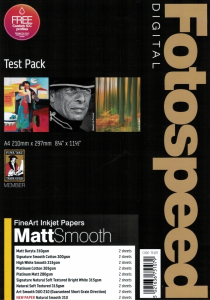
- 8 Fotospeed’s Paper
- 9 Printing Others’ Photos
- 10 Some of the Papers I Tried
- 11 In Conclusion

Have you ever lost the enthusiasm for photography? Mine was starting to wane, but then Fotospeed got in touch, and I rediscovered my enthusiasm for creating images. Now I have been printing my photos like there is no tomorrow.
A while ago, I was running an online workshop for OM Digital Systems. Someone asked me what paper I used for printing. I shocked the audience by saying I didn’t. Years ago, I used to print my images, but for the last decade and a half, I haven’t. I got rid of my old printer because I didn’t use it enough, and the ink inside the printer head regularly dried up. Looking back at the prints I made back then, I can see that the quality wasn’t that great either. I now realize that was partly due to the basic printer I was using and the standard-grade paper I purchased.
After I got rid of the printer, if I needed prints, I would send the files off to WhiteWall, and they would come back perfectly reproduced. That worked well for me.

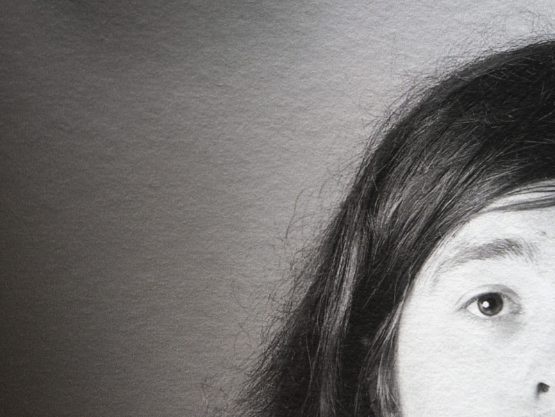
Close up of a textured Platinum Gloss paper print.
Saying Goodbye to My Photographic Mojo
Over the last few months, I’ve become disillusioned with photography. Although my business was running well with plenty of satisfied clients, I wasn’t enjoying it quite as much as I used to. I struggled to find enthusiasm.
We all get in a rut now and again, and I knew it would pass in time. Moreover, experience has taught me that finding new things to learn can often reignite my interest. Nevertheless, I was finding it difficult to discover an aspect of photography I should dig deeper into to reignite my interest. Then, something happened that bolstered my enthusiasm.
Hello Mojo
The photography world is a small one, and someone at Fotospeed got in touch with me. He asked me if I wanted to try some of their paper. “I would love to,” I replied, “but I don’t have a printer.”
I explained to him that I just used Whitewall. “That’s okay,” he told me, “we can get Canon to lend you one.” A few days later, some test packs of Fotospeed paper arrived, and shortly afterwards, a guy drove up from London, which is about 320 miles away, with an enormous transport case containing a Canon PRO-310.
Subsequently, I’ve been learning how to print again, and I’ve found it stimulating. My mojo was back.
Approaching Printing Like a Novice
When I write an article or a review, I am normally writing about something of which I have a reasonable amount of knowledge. However, much of what I once knew about printing I have forgotten. Consequently, I approached this from the perspective of a novice and tried to discover as much about it as I could.
How I Printed My Photos
I tried different programs for printing: Photoshop, Lightroom Classic, On1 Photo RAW, and PhotoLab 8. They all worked. Initially, I tried exporting a DNG from PhotoLab into Lightroom and printing from there. However, Lightroom did not recognize the color profiles produced by PhotoLab, and I ended up with a magenta cast on the images. Exporting as a TIFF instead of DNG solved this problem, but printing in PhotoLab was a simple matter, so I stuck with that.
The Importance of Profiling
Profiling is the management of colors, and doing it correctly gives accurate and consistent results. I was pleased to see that Fotospeed produces ICC profiles to match different printers and papers. You can download generic profiles for their papers, but you can mail a physical test sheet to them, and they will scan that and create a precise profile for their paper at no extra charge. Doing that results in precision of colors and tones when printing on different papers.
Screen Calibration and Rendering Intent
One important factor of color management, also related to consistency, is screen calibration. I always use a Datacolor Spyder Pro to ensure that what I see on screen is as accurate as possible.
Then, I set the rendering intent to perceptual. Used in photography when converting images from one color space to another, perceptual rendering intent is one of the four main rendering intents used in color management. Preserving the overall visual appearance of an image, if some colors fall outside the printer’s reproducible range (called the gamut), it maintains the visual relationships between colors. Consequently, the picture looks natural to the human eye.
As with every advantage in photography, there is a disadvantage. Perceptual rendering intent may lose some color accuracy during that process, but it retains a pleasing appearance and avoids harsh clipping of saturated colors.
There’s a lot more to the technical side of printing to learn. If you are considering printing, an excellent and understandable free e-book on Fotospeed’s website, as well as their numerous tutorial YouTube videos, are worth exploring.
Printing With the Canon PRO-310
The quality of the print relies heavily on the printer. I’ll review the printer I used in another article, but I was astounded by the quality of the Canon PRO-310. It is an A3 printer and has ten individual cartridges. These are not cheap, but they use very little ink on each print; about 1 ml per A4 photo. You can expect to get between 300 and 400 A4 prints from the full set, depending on the print coverage, the paper type, your print settings, and environmental factors.
This might be the printer I buy, but I am also considering the Canon imagePROGRAF PRO-1100. Although more expensive, its ink cartridges are bigger, making it cheaper to print in the long run. Plus, it has an additional two inks.
Fotospeed’s Paper
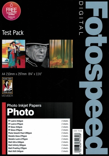
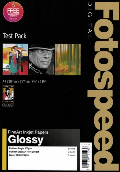
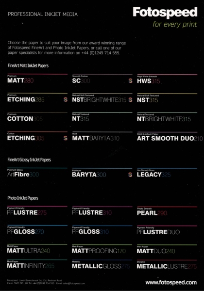
I now think the most important factor is the paper. I was printing onto papers from the Fotospeed Test Packs. The company produces a wide range of paper types. Consequently, the test packs are a great way of discovering which papers are best suited to various types of photography.
Of course, there is a degree of subjectivity when it comes to choosing your paper. Do you want textured, matte, or gloss paper? Furthermore, there are many different papers with nuanced changes within those choices; not every gloss is as glossy as the next, and mattes vary too. Meanwhile, some papers display stronger contrasts than others.
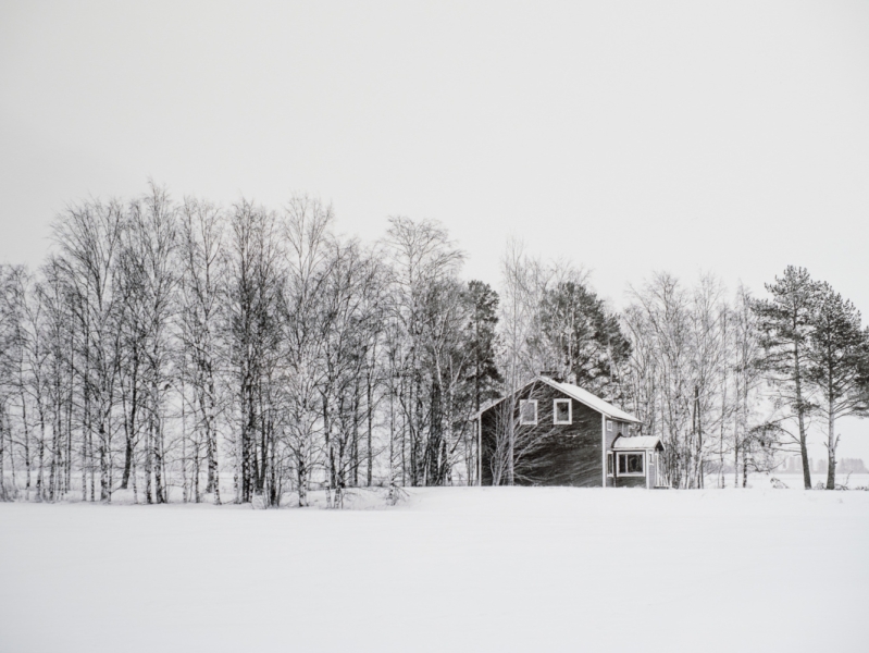
I found that certain subjects looked far better on some types of paper. Portraits, wildlife, and macro shots of insects looked stunning on all paper types, and I especially liked them on the textured paper. Meanwhile, minimalist long-exposure seascapes were far better suited to smooth paper. I mostly prefer matte paper over gloss, but that is an entirely personal view. That said, I found black and white street photography looked great on gloss paper, giving it a timeless feel.
Printing Others’ Photos
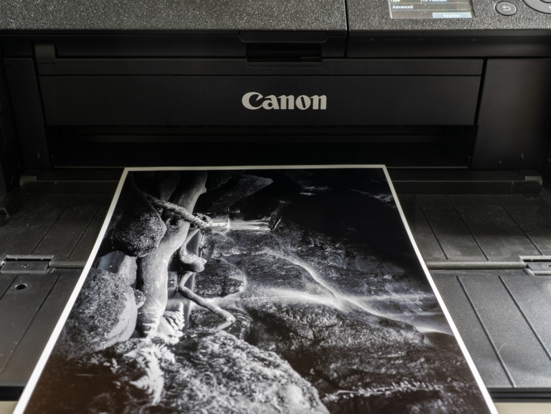
While I had the printer here, I had a couple of jobs that required prints. Firstly, a silversmith, photographer, and artist friend in Poland who runs a studio workshop for artists, wanted some high-quality prints of her work. I printed a series of low-key images of her work. The header image at the top of this article shows a scan of one of her silver artworks being printed. The dynamic range of the print was outstanding, with deep, rich blacks.
Then, I had an urgent job to do. I got an unexpected phone call on a Sunday afternoon from home. They had booked a photographer who didn’t turn up. I dropped everything for them and rushed over with my camera, flash, and tripod. They needed 5 x 7-inch prints urgently, and I had no paper that size. So, I quickly ordered a box of another brand’s “professional paper” from the limited range available on Amazon. Although the results were okay, they were nowhere near as good as those printed on the Fotospeed paper.
Some of the Papers I Tried
As you can see from the list above, there is a big selection of paper available in the test packs. I tried most of them. So long as I matched the photo to an appropriate paper, the results were all outstanding. Here are a few of the papers I tried with close-up photographs of the prints I made. Something I discovered was that photographs and scans of the prints gave results that were a poor reflection of the print.
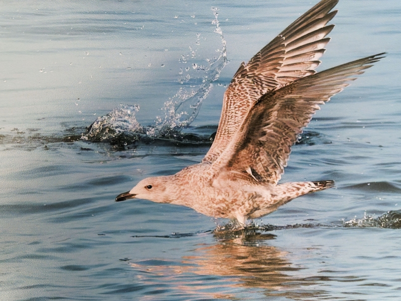
A close-up photo of a print on the Metalic Lustre 275 GSM paper. The splash of the water and the golden hues of the gull really shine with this paper, although that doesn’t show when photographed. I bent the edge of the paper so the reflected light shows the texture.
Platinum Baryta 300
This is a premium, 100% acid-free fine art paper.
Baryta refers to a coating of barium sulfate that lies between the paper base and the emulsion layer. It was originally developed for darkroom processes, and its smooth reflective surface enhances both image sharpness and tonal range. Baryta papers are often favored by fine art photographers and galleries for their museum-quality appearance and their ability to emulate traditional silver gelatin prints.
With a natural white base and an advanced microporous ink-receiving layer, it has a D-MAX of 2.99. D-MAX is a term used in photography and printing to describe the deepest, richest black that a paper and ink combination can produce. Inkjet printing on high-gloss or baryta papers typically achieves D-MAX values between 2.6 and 3.0. In other words, it’s a key measure of a print’s contrast and tonal range, and this has a high D-MAX rating.
It also gives a wide color gamut, thus reducing the chances of clipping. With its smooth, unglazed, glossy finish, I found this paper rendered deep blacks with smooth changes in shadows on my prints.
The paper is certified by the Fine Art Trade Guild and offers archival quality. When used with pigment inks, as with the other papers I mention here, it ensures a print longevity of over 85 years.
I printed monochrome and color photos on this paper, and the results were fabulous. It produced the sharpness and timeless feel I like in black and white. I also printed the same picture on this and other papers using their specific profiles, and the colors matched perfectly.
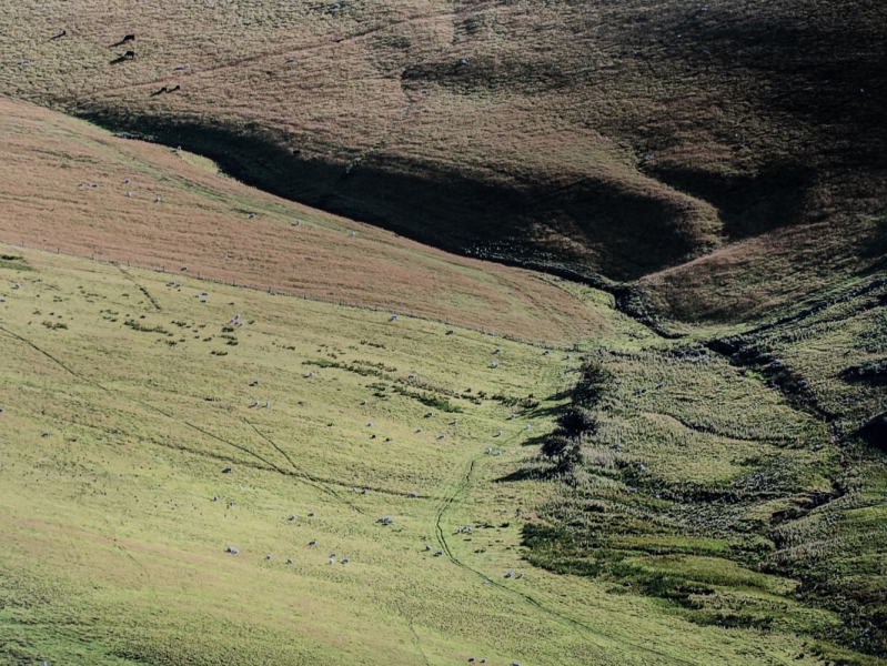
A section of a print I used for comparing colours and tones between papers, this one on Fotospeed Platinum Baryta 300gsm.
Fotospeed Natural Soft Textured Bright White 315
This heavyweight paper also gave exceptional results.
It is a premium 315 gsm fine art paper made from 100% cotton. It has a gently textured surface and a bright white base. Fotospeed says it is designed to produce exceptional image clarity and tonal depth. Therefore, it’s ideal for both landscape and portrait photography. That is exactly how I tried it, and it lived up to their promises.
This paper also supports a wide color gamut and a high D-MAX, thus delivering rich blacks, vibrant tones, and fine detail. It is also certified by the Fine Art Trade Guild, meeting archival standards, with longevity of over 85 years when used with pigment inks. Although I only used it with pigment inks, it is compatible with dye inks, too. That makes it a versatile choice for photographers, professional artists, and gallery-quality printing.
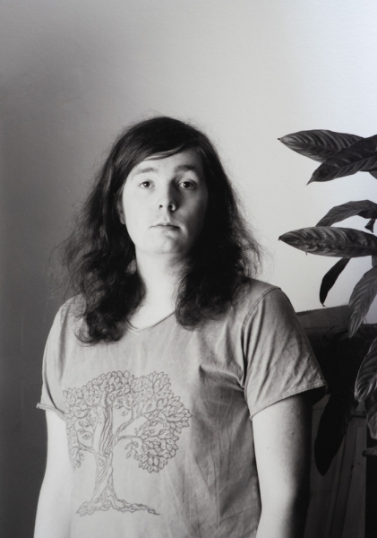
This, and its variants, is what I used for portraits and some artistically styled wildlife photos.
When I wrote this article, I realized that I had given away the pictures I printed on the Natural Soft Textured Bright White 315 GSM paper and hadn’t photographed it. This one was printed on the Pigment Friendly Gloss paper.
Fotospeed Natural Smooth 310
Just released, this is an interesting paper designed for photographers and artists who want to balance exceptional quality with making a conscious choice for sustainability. It is made with 34% hemp, 33% recycled materials, and 33% alpha cellulose for a premium yet eco-friendly composition. Its smooth surface brought out fine details and textures, and a wide gamut of colors. It again has archival performance and is acid-free.
This is a section of the photo you can see sitting on the printer in the photo above. My old scanner doesn’t do justice to the quality of the print.
Fotospeed Platinum Etching 285
This paper wowed me. As I mentioned, this fine art paper has a silky, textured surface that matched my taste when used for wildlife, macro, and portraiture. Like the others, Platinum Etching 285 is also 100% acid-free. With a natural white base, it claims a state-of-the-art ink-receiving layer, delivering a high D-MAX and wide color gamut. It’s made from 25% cotton and 75% alpha cellulose. When used in conjunction with pigment inks, the paper will ensure a print life of more than 85 years.
Platinum Etching 285 gsm paper.
In Conclusion
It’s impossible to show you on your phone or computer screen exactly what the prints look like; the reproductions, either scanned or photographed, are nothing compared to the original prints. I could spend all day talking about the results of the various papers. However, my ongoing exploration of them for different types of photographs means that any conclusion I come to could soon be changed when I print the next image.
It’s also traditional for us writers at Fstoppers to write what we like and what could be improved next time when we review products. All I can say is that the quality of the prints was of the highest standard and none have disappointed. I just needed to choose the correct paper for the subject and the desired effect.
I am grateful to Fotospeed for coming along at the right time and offering exactly what I needed to motivate me once more. It was probably a good move on their part, because I am going to put my money where my mouth is and buy a printer from them with plenty more of their paper in the future. It’s been a huge and enjoyable learning experience for me, and I can see there is much more I can discover.
A wide range of Fotospeed paper is about to be made available on the B&H website, so be sure to bookmark this link.
Putting my money where my mouth is, I bought a Canon imagePROGRAF PRO-1100 Professional 17″ Wireless Inkjet Photo Printer, the big brother of the printer I borrowed, plus a stock of Fotospeed paper.
If you are regularly printing, it would be good to hear about your learning experience. Do you still enjoy it as much as you did? Or, if you are considering taking up printing, are there questions you have that our readers might be able to answer?